ONS All-Cause Mortality Statistics are Disastrously Wrong
The UK's ONS claim the country has the worst death toll in Europe, but their methodology is flawed and their data is littered with statistical errors. In reality, the UK has a lower all-cause mortality rate than Portugal, Italy and Germany. Sweden is lower than Finland, France and the Netherlands.

On the 30th July 2020, the UK’s Office for National Statistics posted a report titled "Comparisons of all-cause mortality between European countries and regions: January to June 2020". This was quickly followed by news stories followed claiming the UK had the highest death toll in Europe.
Their data is littered with flaws; partial data, missing countries, incomparable sources and even spelling mistakes. Their methodology was questionable - despite the report claiming to investigate "all-cause mortality", they exclusively showed results on the basis of excess mortality. The publication of this report in this state seems morally questionable, given the ONS have needlessly exposed the public to misinformation and unnecessary psychological distress. In this post, I would like to describe some of these failures.
"All-Cause Mortality" Confused with "Excess Mortality"
Whilst the report title indicates a study into “all-cause mortality”, the report bases comparisons exclusively on excess mortality. Excess mortality is a metric that shows how far above average deaths are for a given period of time, all-cause mortality typically instead shows the number of deaths expected for a given amount of the population (e.g. deaths per 1000 people).
The Chief Medical Officer, Professor Chris Whitty, has repeatedly said all-cause mortality is the recommended comparison metric once the pandemic is over, he told a Parliamentary Committee on the 24th April: "For all countries, it should be all-cause mortality, age adjusted, and possibly seasonally adjusted, over the course of the epidemic, and we are not there yet”.
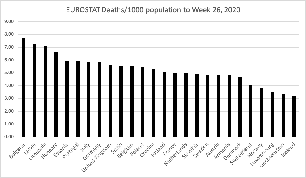
The ONS report itself does not cover all European countries, as the report is largely based on Eurostat data which was not yet complete for all countries when the data was prepared. As surprising as it may be, Eurostat data for 2020 mortality to week 26, shows that the UK has a lower all-cause mortality than Portugal, Italy and Germany:

All-cause mortality indicates the real risk to someone in the population dying, whilst excess deaths merely compares a country to its own performance over some kind of average over prior years. For example; suppose there was a hypothetical country where no one lived beyond 30 or had underlying health conditions. For this country, even though they may well have higher all-cause mortality than other countries during the pandemic, they would have next to no excess deaths during the pandemic as they would have no vulnerable population.
Indeed; countries with the best healthcare systems, which successfully cut mortality for the elderly and the most vulnerable, are most at risk of being misrepresented by “excess deaths” measurements. You may be far less likely to die in those countries during a pandemic, but they will still nevertheless be reported as having high “excess deaths”.
One potential cause is highlighted by Dr Chris Hope in a recent working paper demonstrating that "the death rate from COVID-19 is significantly negatively correlated to the intensity of the last two flu seasons in 32 European countries."
Age-Adjusted All-Cause Mortality
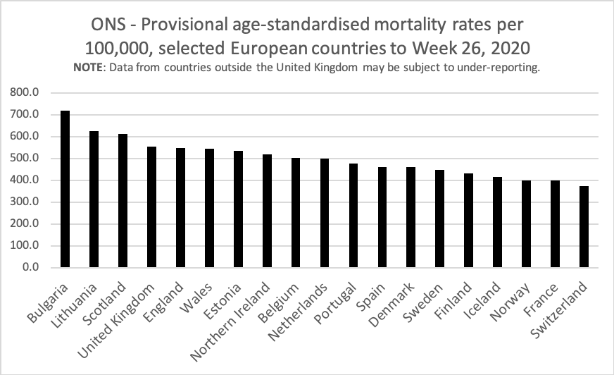
The ONS raw data did include “age-adjusted” all-cause mortality metrics, but this raises another problem. The raw data includes a note indicating that the data of 20 European countries countries "may be under-reporting the actual number of deaths and they are likely to be revised." As UK data is supplied by the ONS, the raw data contains a notice that any comparisons between the UK and the EU should "be subject to caveats in relation to the temporal comparability".
Further, I identified that 5 countries in the ONS data set had missing data - meaning only 15 of 27 EU Member States were included. Countries with a higher all-cause mortality than the UK, like Germany and Italy, were amongst those with missing age-standardised mortality data.
Even with this caveat, and data from only a subset of countries, the ONS data shows that in terms of all-cause mortality adjusted by age, Scotland has a higher age-adjusted all-cause mortality rate than England and that the UK certainly does not have the highest mortality in Europe:

Furthermore; as time goes on, the picture will likely look even more nuanced for the UK. Countries before us in the pandemic saw their mortality data drop below average following their pandemics - this is a sad phenomenon known as “displaced mortality”, where there are less individuals likely to die in the immediate short-term. The UK has already begun to see this in recent weeks, and our mortality data will continue to trend below average in future weeks. Indeed, this may be the worst time for us to evaluate UK mortality data, but nevertheless the catastrophic predictions of us having the worst overall mortality rates in Europe remain untrue. Further, we don’t yet understand the impact of subsequent waves, if any.
An Unmitigated Disaster
This ONS data is an unmitigated disaster. The ONS did not even run a spellchecker on their supplied Excel spreadsheet of raw data (including spellings of "masures" and "countires" in the Contents page).
Whilst they claim to compare mortality by country, they instead compare each country to its own average and then perform international comparisons. They super-imposed their own data atop of Eurostat data, despite knowing of under-reporting concerns. They include countries with missing data in their comparisons. In their rush to publish this work, they go so far as to not wait until data becomes available for major European countries like Italy and Germany.
As all-cause mortality data has become available, it is questionable why the ONS has chosen to continue to use excess mortality for international comparisons. Making both forms of data accessible, with effective discussion on the benefits and limitations of each, would allow far more informed discussion.
I would deem the quality of this dataset to be unacceptable from an undergraduate student. Any researcher should be ashamed to publish something of this quality. The publication of this work appears to be highly unethical given the misrepresentation it presented to the general public.
Issues with data aren’t new to this pandemic. Oxford University’s Centre for Evidence-Based Medicine have recently highlighted a worrying trend of high deaths at home and discrepancies between positive test-based and death certificate-based deaths. A recent review of data reduced England's death toll by 5,000.
Throughout the COVID-19 pandemic, statistics and data are not just consumed by scientists and statisticians, but by the public as a whole. To have informed debate, statistics should be presented to inform rather than invoke fear.
Finally - it is important to note this data should not be used as a guide for policy; different countries have different characteristics (temperature, humidity, population density, distance to neighbours, population with pre-existing T-Cell immunity, etc). Such comparisons form incredibly weak evidence for scientific purposes, where instead Randomised Control Trials and systematic literature reviews provide a more sound basis.